
PRINT DESIGN + LAYOUT:
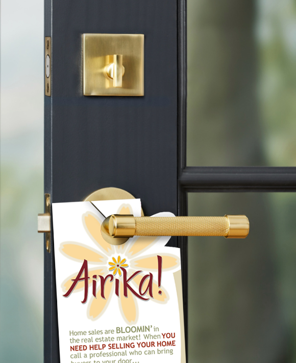
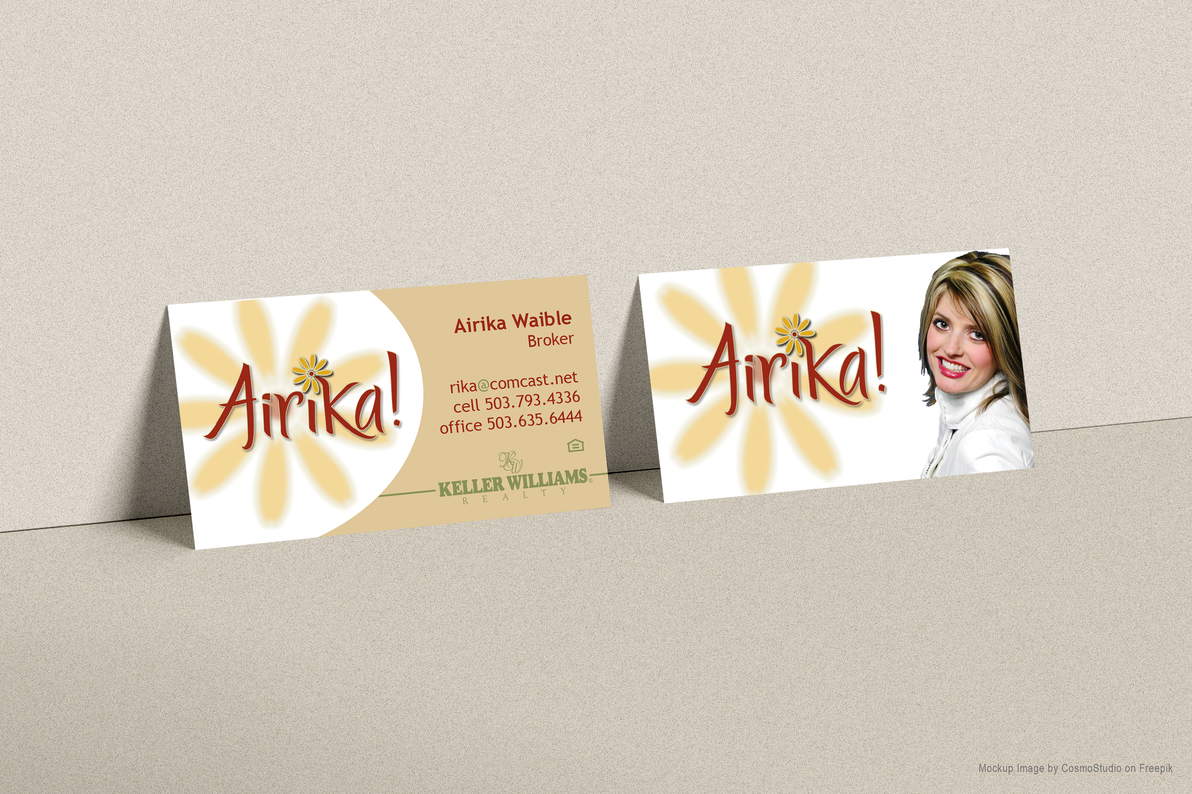
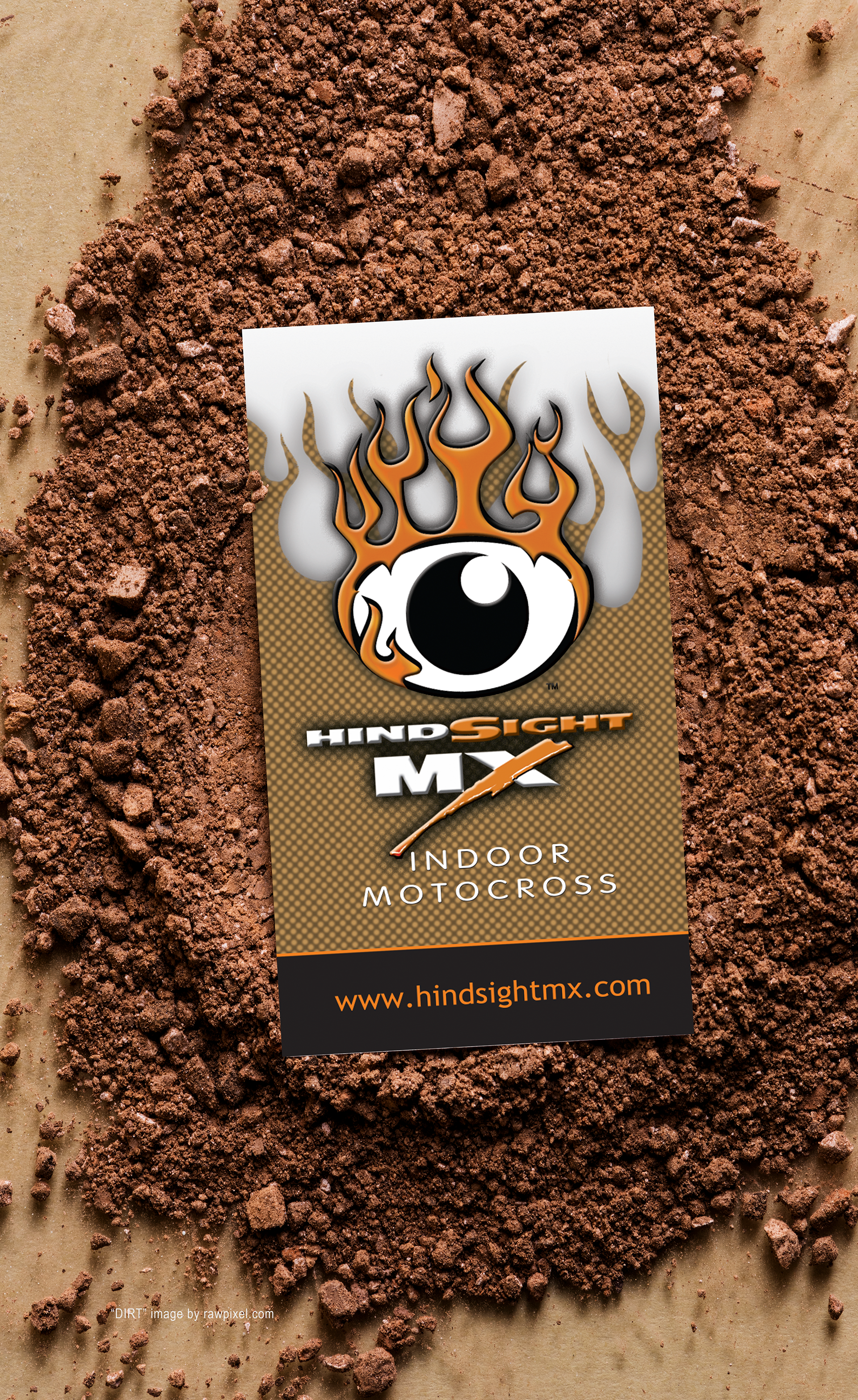
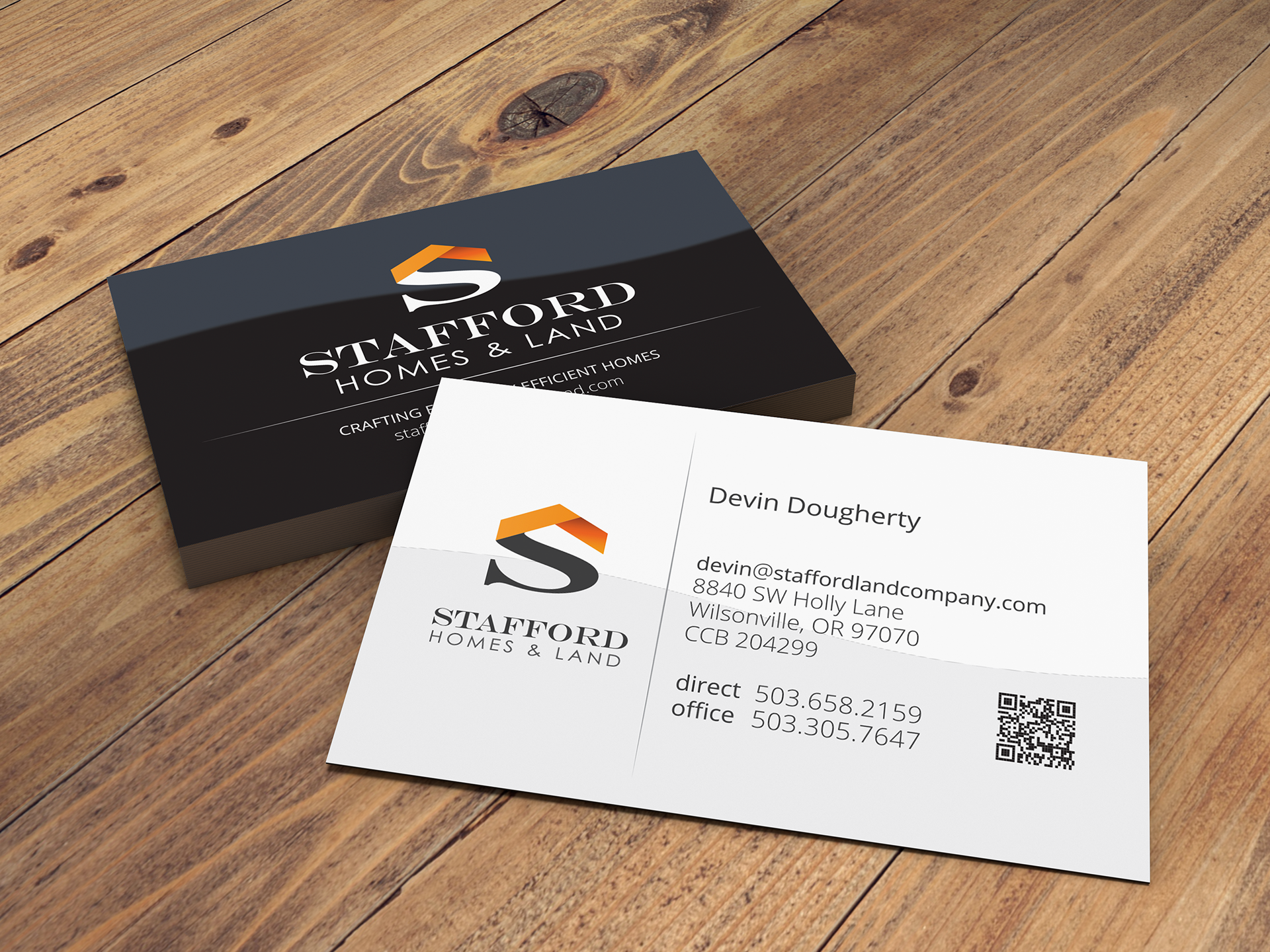
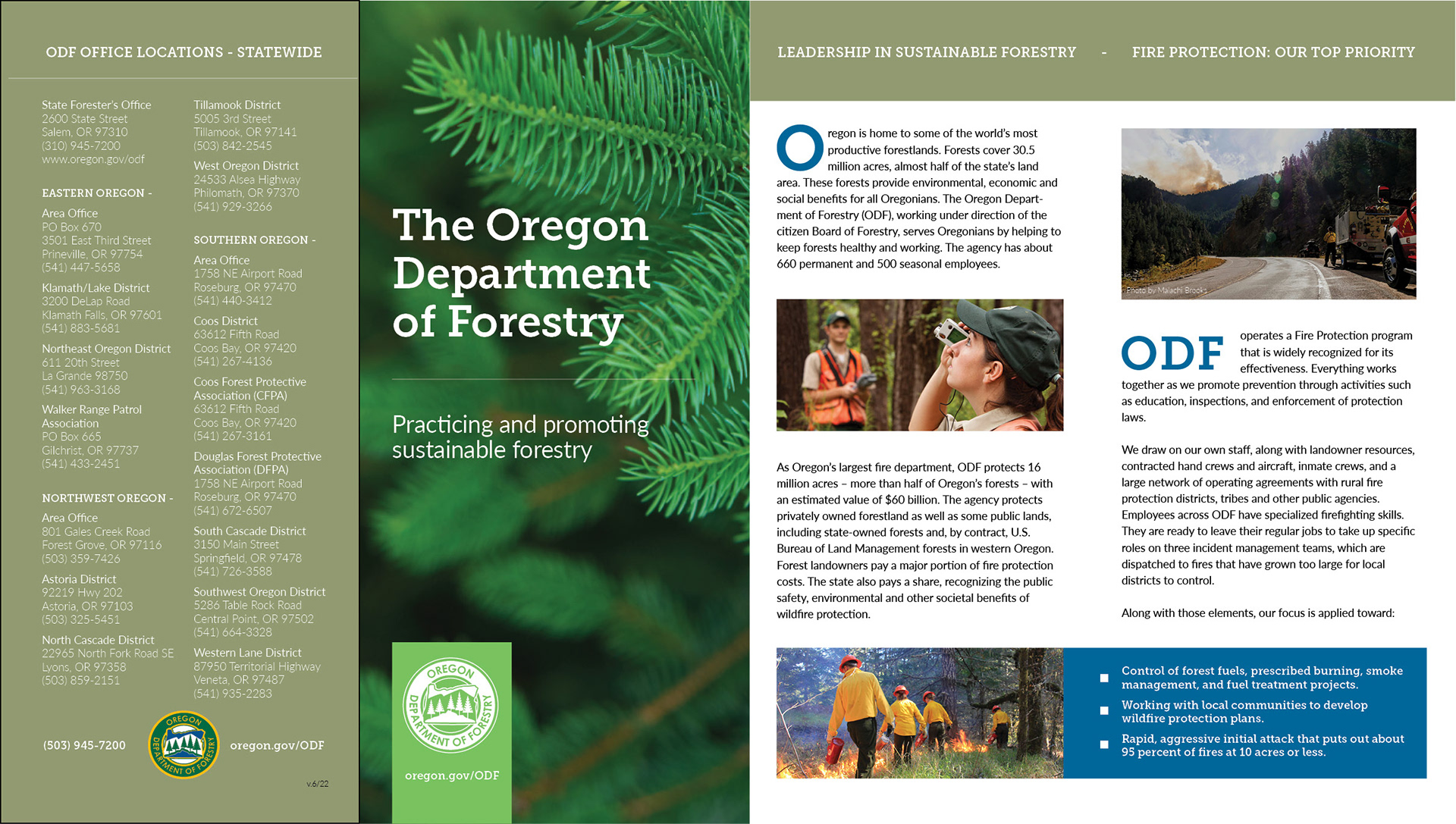
From the top: The marketing materials for Airika needed to convey a cheerful, welcoming presence. HindSight MX offered pro class, indoor dirt motocross regardless of the weather outside. The logo I designed was edgy, powerful and aggressive - and so were the marketing collateral materials. The accurate and precise service delivered by Hytek Company was reflected in my logo design and all printed items. From vehicles to inventory stickers, the message stayed true. For Stafford Homes and Land the premise was to evoke the elegantly efficient build quality of the homes they constructed. The double gate-fold brochure for Oregon Department of Forestry offered a brand new design for the agency.
From the top: The marketing materials for Airika needed to convey a cheerful, welcoming presence. HindSight MX offered pro class, indoor dirt motocross regardless of the weather outside. The logo I designed was edgy, powerful and aggressive - and so were the marketing collateral materials. The accurate and precise service delivered by Hytek Company was reflected in my logo design and all printed items. From vehicles to inventory stickers, the message stayed true. For Stafford Homes and Land the premise was to evoke the elegantly efficient build quality of the homes they constructed. The double gate-fold brochure for Oregon Department of Forestry offered a brand new design for the agency.
BOOKLET / CATALOG DESIGN + LAYOUT:
BOOKLET Designed and printed to showcase Stafford Homes entry in the NW Natural Street of Dreams, the booklet is one of my favorite projects. And the house was delish! CATALOG created for CEL (California Eastern Laboratories) to show the entire gamut of of optocouplers and solid state relays. Along with massive amounts of paragraph-styled texts, my spot product illustrations and photo work were all packed into this InDesign layout project.
BOOKLET Designed and printed to showcase Stafford Homes entry in the NW Natural Street of Dreams, the booklet is one of my favorite projects. And the house was delish! CATALOG created for CEL (California Eastern Laboratories) to show the entire gamut of of optocouplers and solid state relays. Along with massive amounts of paragraph-styled texts, my spot product illustrations and photo work were all packed into this InDesign layout project.
BELOW FOR SACRAMENTO REVIEW
FOR REVIEW: CITY OF SACRAMENTO
The comp sample shown here is to help simplify the user experience on mobile screens.
CHALLENGE: The current 2-up YPCE horizontal booklet is difficult to use on a smartphone.
SOLUTION: For the existing page 7, I've designed a vertical aspect ratio infographic and text page with QR and hyperlinks that open respective web pages for specific information. This PDF can be printed for display or at home for personal use.
NEXT UP: I created an similar, mobile-first version that is even more efficient - which is shown in the preview PDF available below (and it works with page readers for 508-compliance).
MORE FOR SACRAMENTO REVIEW
Having created the community centers and pools map, the next item is to build an all-new 508-compliant booklet.
The City has a brand-new website and what goes better than a similar themed document? The InDesign file I have prepared is US Letter-sized and adheres to a high contrast text/background rule. All elements to be page reader ready and searchable.
The City has a brand-new website and what goes better than a similar themed document? The InDesign file I have prepared is US Letter-sized and adheres to a high contrast text/background rule. All elements to be page reader ready and searchable.
This requires leaning less on graphic attributes such as gradients and images. Tables can be a problem, so I had to create an accessible table style sheet for those instances. Except for the titles (Montserrat) all font variations are to be of the Source Sans Pro typeface.
Each page of the 13-page limited build preview PDF is already 508-compliant. Please use the Acrobat Read Out Loud tool (From the top-left menu, click View, then Read Out Loud) to listen. 10/26/23
----------
The above PNG icon for 311 and the 6-languages poses a problem...no translation available. Truth being that there's no easy way to do it in the PDF format because it was not built for such tasks.
So, when creating the InDesign file for export to PDF, I also save as a text-only Word document. One can then translate to the proper language from that file. Remember mobile-first and
508-compliance. The simpler the better! Here is the Word text-only version
So, when creating the InDesign file for export to PDF, I also save as a text-only Word document. One can then translate to the proper language from that file. Remember mobile-first and
508-compliance. The simpler the better! Here is the Word text-only version
BOOKMARK COMP
Because I am an inclusive developer and always seek to connect with a broader spectrum of people, an idea came to somehow merge two entities: Sacramento Library and YPCE. The library offers outdoor reading for children at some locations, which is in line with YPCE purposes. To bring the two programs into each other’s radar could result in even more participation at various levels. I then considered what a simple promo piece might entail, and where. Libraries have bookmarks and flyers for the public to take home. They also have a calendar of events to share with library visitors. Sacramento is blessed with a diverse population, so these take away items must be presented in the languages of our metro area. My bookmark follows this mandate, with examples in both English and Russian. The bookmark offers 2 messages; an overall note to read with your child, then a specific ‘where to go and when’ version. The bookmark adheres to my COAP booklet layout design, which stays close to the new Sacramento web theme. In all, a nice diversion which suits my career desire to reach people where they are – as they are.
Design, layout, photography* and illustration by Jeffery Plummer
(*Quintessence home photography by Erik Bishoff)